

RISC OS 3.7 User Guide
16 Using fonts in applications 
RISC OS uses fonts in all its windows and directory displays. This chapter shows you how to choose, use, control and print with fonts.
Strictly speaking, a font is a set of characters with the same fontname (or typeface), weight, style and size. An example is Homerton Bold Oblique 18pt:
- Typeface is the name (e.g. Homerton) given to a whole font family and describes all fonts with the same general appearance.
- Weight indicates the thickness of the characters (e.g. Bold).
- Style is the variation of the basic typeface (e.g. Oblique).
- Size is measured in points (see page 186).
RISC OS fonts
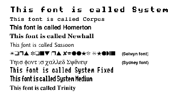
Your computer is supplied with a set of fonts permanently built in. You can choose the font used by the Desktop (see Fonts on page 46) and use different fonts in some application windows that allow it (e.g. Draw). Here are the fonts supplied:
Most RISC OS fonts are Acorn versions of standard fonts. The table overleaf tells you more about this.
Most fonts can be used in any size and have italic and bold variants; some of them use proportional spacing, so that a narrow letter such as 'l' takes up less horizontal space than a wide letter, such as 'M'. Other fonts are 'monospaced' (or fixed pitch).
RISC OS font: Equivalent: Description
- Corpus: Courier: Fixed pitch
- Homerton: Helvetica: Proportional
- Newhall: New Century SchoolBook: Proportional
- Sassoon: None (special Acorn font): Proportional
- Selwyn: Zapf Dingbats: Includes arrows, stars, ticks and crosses
- Sidney: Symbol: Includes greek and mathematical symbols
- System (fixed): None (special Acorn font): 'Old style' fixed pitch
- System (Medium): None (special Acorn font): 'Old style' proportional
- Trinity: Times Roman: Proportional
- WimpSymbol: Used by the desktop; don't use this in applications
Serif and sans serif fonts
A serif font (like Trinity) has strokes at the edges of the letters which allow your eye to follow on from one letter to another. Sans serif fonts (like Homerton) don't have these. Sans serif fonts can make the page look tidier; they're often used for headings and other places where large font sizes are used.
Font size
Most applications let you select the size of the font you want to use. Font size is measured in points (a point being 1/72 of an inch) and is the distance between the highest ascender and lowest descender of characters in the font:
Some applications also allow you to set the font height separately. If you want characters with different height and width values, set the size first and then the height. Acorn fonts can be sized to any height or width allowed by the application:

Outline and bitmap fonts
Fonts are controlled by a part of the operating system called the Font manager. Initially, the Font manager stores just the outlines of fonts.
When you choose to use a particular font, the computer calculates the bitmap font needed to display that font at the desired size. A bitmap tells the computer exactly which pixels to paint on the screen to render a given character at a given size.
Outline fonts are converted into bitmap fonts because the computer can send these to the screen much faster.
Adding more outline fonts
You can purchase additional Acorn outline fonts for your system from third party suppliers (use !Boot to add new fonts - see page 46). You can also use many of the PostScript type 1 fonts available (see page 169).
Choosing and using fonts in applications
Two applications (Edit and Draw) are supplied that use fonts, but they use them in different ways:
- Edit can display text on the screen in any RISC OS font. However, it can only print out in the font that is standard on your printer.
- Draw can both display and print fonts of varying size and typeface.
Most applications you'll buy that can make use of fonts (e.g. desktop publishing packages, word processors or drawing tools) will behave like Draw.
Using fonts in Edit
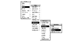
You can use the Display/Font/Font List menu to change the font used to display text on the screen.
Using fonts in Draw
To use different fonts in Draw:
- 1 Select the Text tool.
- 2 Click Menu over the Draw window.
- 3 Choose a font from the Style/Font name/Font List menu by clicking Adjust.

- 4 Choose a font size from the Style/Font size/Size menu.
Now, when you type in text, it will appear in your chosen font. See Defining a path object's style on page 237 for more details. You can also choose the outline and fill colours for the text.
Using !Chars to preview a typeface
You can use the Chars application to see what a particular typeface looks like before you decide to use it. You can also use Chars to enter special characters into an application window or dialogue box. See Chars on page 351.
For other ways of entering special characters, see Character sets on page 457.
How the Font manager works
The Font manager uses various techniques to optimise font quality (on-screen or printed) whilst ensuring that your computer's performance doesn't suffer:
- Anti-aliasing
- Hinting
- Font caching of bitmap fonts.
Anti-aliasing
If the outline of a character passes partially through a pixel (a pixel is the smallest building block available on the monitor screen), a non-anti-aliasing font can only paint the whole pixel or none of it. The result is a jagged edge to the character.
Anti-aliasing relies on an optical trick: the jagged edges are smoothed out by the addition of extra pixels in intermediate colours. You can see how this is done by first typing some text in an Edit window using a fairly small size (12 or 14 point) and choosing Display/Font/Trinity/Medium to display the text in an anti-aliased font. Then use !CloseUp (described on page 355) to have a closer look at the text.

Sub-pixel anti-aliasing
This controls a refinement of anti-aliasing in which four separate versions of each character are stored in the font cache. This can have a beneficial effect on the quality of characters at small sizes. However it is heavy on computing power (see Controlling anti-aliasing on page 190) and may result in unacceptably slow screen updates. This parameter is relevant only to the screen; it does not affect printing.
Hinting
This is another technique used by the Font manager to improve the appearance of fonts. It applies both to the screen and to printers. The outline of the character being displayed (or printed) is subtly altered in ways that depend on the resolution of the image being produced. It is used on-screen if anti-aliasing is disabled.
Hinting is particularly effective when fonts are scaled, and when half-tones are not available (as on most printers). You can't control hinting, as you can anti-aliasing; it's used automatically if you disable anti-aliasing.
Font caching of bitmap fonts
The computer keeps as many bitmap fonts as it can in an area of memory called the font cache. If the font cache is not large enough to hold the bitmaps of all the current fonts, any extra fonts are loaded as necessary.
The computer attempts to retain in memory the fonts which are in greatest demand, but this requires some sophisticated guesswork. Since this is not always totally successful (the computer cannot read your mind!) there is sometimes a delay as the font is loaded from the filing system and displayed on the screen.
Matching font performance to your needs
 The Font manager is set up to provide a reasonable blend of screen quality and performance for the majority of users. There is inevita bly a trade-off between speed and font appearance. RISC OS provides two ways of tailoring font performance to your needs and preferences. You can
- change the way anti-aliasing is done (or switch it off altogether)
- change the size of the font cache.
Controlling anti-aliasing
You can use the Fonts Configuration window of !Boot (see page 46) to place an upper limit on the size of anti-aliased fonts; fonts in larger sizes are printed without anti-aliasing. Larger fonts benefit less from anti-aliasing, and since a computed anti-aliased bitmap font occupies a lot more memory than a non-anti-aliased bitmap, for most purposes it is not worth displaying large fonts with anti-aliasing. This parameter is relevant only to the screen display .
Note: If you use sub-pixel anti-aliasing, you should increase your font cache by four times to store the extra font shapes needed. If you don't, your computer may slow down considerably.
Changing the minimum size of the font cache
 If you're using a lot of different fonts, increasing the minimum size of the cache means that the text is drawn more quickly. You can set it permanently (see Memory on page 43) or for the current session only (see System memory allocation on page 63).
The best size for the font cache depends on several factors: how much memory your computer has, whether you have a hard disc, and the number of fonts you're using. A computer with 4MB of memory can benefit from a cache of 256KB.
If the cached bitmaps value is set high, and you're using a few large fonts - for headlines, perhaps - they may take up all the font cache, flushing out smaller fonts. The smaller characters will then have to be cached again when needed. This effect can slow down printing and the display.
This parameter is relevant for the printer, especially if you are printing documents with a lot of text. Its ideal value depends on the screen mode, printer type and the printer resolution. If you are printing at a high resolution, you may want to increase the font cache.
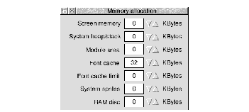
Warning: The Font cache size set in the Memory allocation screen is overridden by the value given in your Desktop boot file. If you change the Font cache size you must also save your Desktop boot file again so that your change can take effect (see Saving a Desktop boot file on page 53).
Note: Do not set a font cache of less than 32K. Sub-pixel anti-aliasing (see page 189) requires more font cache. For example, Homerton.Medium as a desktop font needs a font cache of 32K. With sub-pixel anti-aliasing turned on, it needs 128K. If you see an hourglass on the screen as the desktop is redrawn you may need to increase the font cache size.
Allowing the font cache to grow
You can set the maximum font cache size using the Font cache limit option on the Memory allocation screen of !Boot.
If the font cache is too small, the Font manager attempts to increase its size up to the Font cache limit. If this happens, it shrinks back to the normal current size as soon as any fonts can be discarded. The Font manager decides to do this rather than throw away cached blocks of fonts currently displayed.
If the Font cache limit is zero, or smaller than the default font cache, the cache will not expand. If you are using several fonts you may want to set this to a high value (e.g. 256K). A rough yardstick, if you're using fonts intensively, is to allow 64K per megabyte of memory.
Printing with fonts
 When printing , there are conflicting requirements for memory. The Font manager needs memory to cache fonts, and the printer driver needs memory to build up a page image to send to the printer. As both of these affect printing speed, you will have to experiment to find the optimum. Typically, more memory given to the font cache (or maximum font cache option) results in quicker printing.
The maximum size of cached bitmaps affects whether fonts are cached when printing. If this value is smaller than your typical body text size, there may be a very long pause at the start of each printed page, as all the characters on the page are rendered from the outline form.
The RISC OS Printer manager program sits between an application and the printer, and oversees the printing process. Printers, printing and printer drivers are explained fully in Printing your files on page 143 and Setting up printers on page 125.
PostScript printers
PostScript printers have their own set of fonts stored internally. When you print to a PostScript printer, most Acorn fonts are mapped to these internal PostScript fonts. Acorn fonts that cannot be mapped to PostScript fonts (e.g. Sassoon) are sent to the printer by the Printer manager as they are needed.
Most Acorn fonts can be mapped to PostScript fonts. For more information about using Acorn fonts with PostScript printers, refer to FontPrint on page 163.
Converting PostScript fonts to outline fonts
It is possible to convert standard PostScript Type 1 fonts to Acorn Outline fonts using the T1ToFont application T1ToFont on page 169).
Changing the desktop font
You can change the font displayed in directory displays, menus and so on (see page 47). It's best to choose one of the fonts stored in the computer's ROM (e.g. Homerton or Trinity) as the screen will redraw more quickly.
Troubleshooting
If every screen redraw causes intensive disc and hourglass activity, then the font cache may be too small to hold the range of fonts you are trying to use. In these circumstances, try the following:
- Increase the size of the font cache using the Task manager/Task display window. The addition of even small amounts of cache can often improve things dramatically.
 Reduce the maximum size for anti-aliasing. This will enable the font cache to be used more economically with a large number of fonts. You should not normally reduce the maximum anti-aliasing size below 12pt.
- Reduce the maximum size of cached bitmaps value. This should reduce disc activity, but the action of redrawing the screen will become much slower.
- Use a smaller selection of fonts and font sizes in your document.
RISC OS 3.7 User Guide - 22 JAN 1997


